Copernicus Contributing Missions
Information design concept
Making Europe’s evolving Earth-observation ecosystem easier to read.
Context
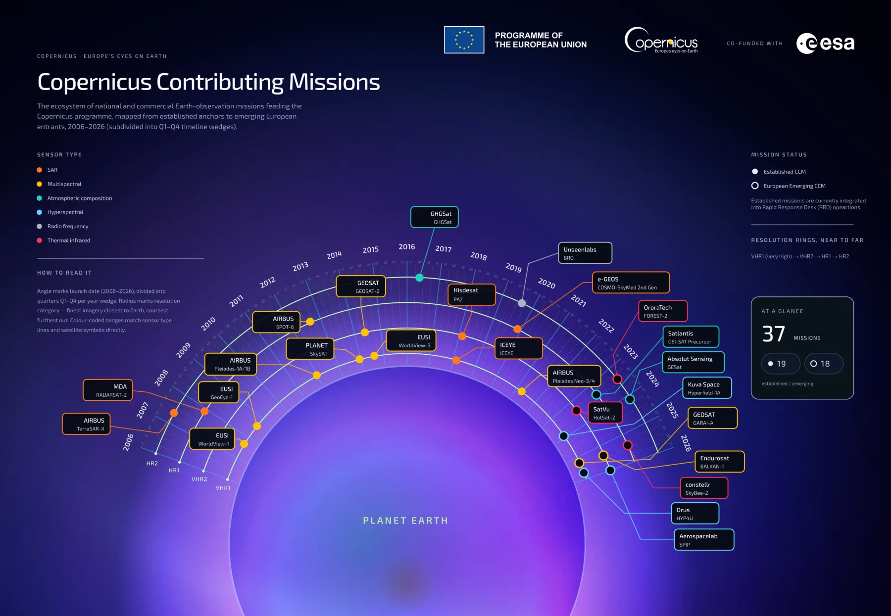
As part of a proposal for ESA’s Copernicus Contributing Missions communications work, I developed a new visual direction for an existing mission infographic. Proposal concept for ESA Copernicus Contributing Missions editorial and graphic support.
Tension
The challenge was not to add more information, but to make an already complex dataset easier to navigate at a glance.
Role
Concept development · Information architecture · Art direction · Graphic design
Approach
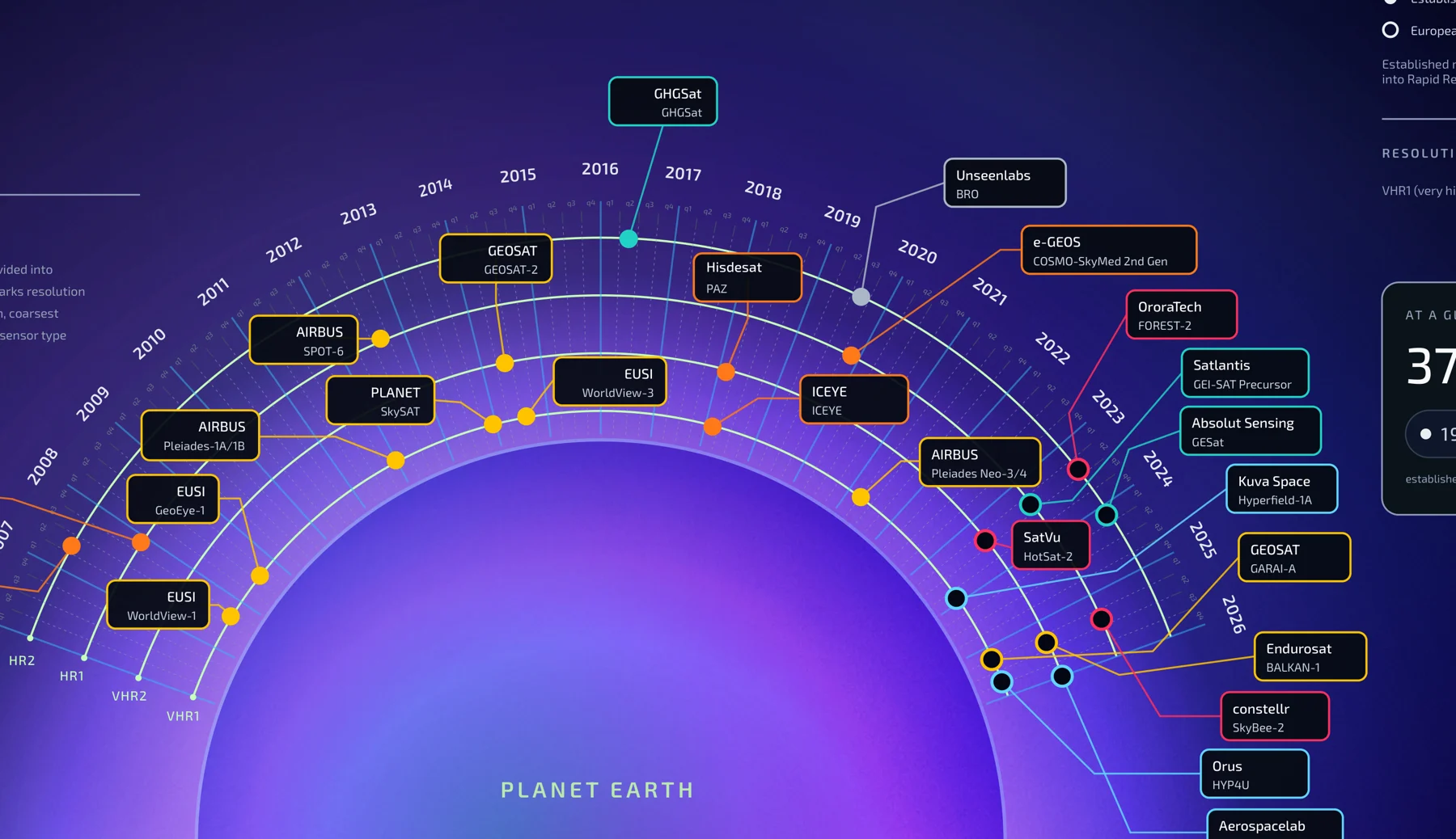
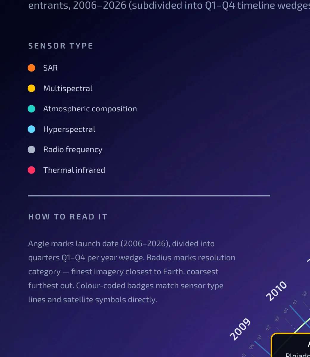
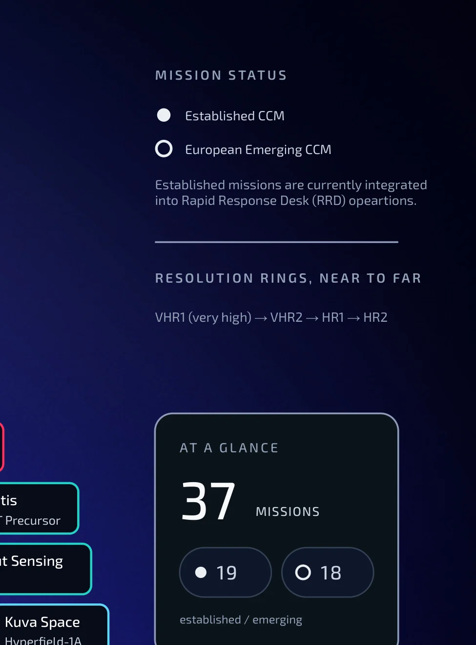
I retained the radial structure, using concentric rings to represent spatial-resolution categories, while redesigning the wider information system: chronological launch information, sensor-type colour coding, mission-status markers, labels, hierarchy and spacing. Rather than presenting satellites as isolated objects, the concept shows them as part of an evolving observation network around one shared subject: Earth.
What I Made
Information design · data visualisation · Earth observation · visual systems · editorial graphics.